Author(s): Shriyash Shete
Data Protection is an integral part of cybersecurity. With enormous amounts of data being produced, transferred, and consumed every day, securing an organization’s sensitive data from leaking to the external internet is one of the challenges companies and cybersecurity professionals deal with every day. We found that the existing policy and criteria-based approach in cybersecurity software to identify anomalous activities limits the visibility, makes security administrators’ jobs time-consuming and ultimately leads to weakened data security. In this paper, we investigate how cybersecurity professionals can solve this problem with the power of AI/ML and we propose a more intuitive, novel dashboard and drill-down interface solution to make the sensitive data classification, organization, visibility, synthesis, and finally remediation efficient for security administrators.
For any actively operating organization, data generation in the form of text documents, images, code snippets, emails, slides, and software is very common. Employees access data and interact with it to do their day-to-day jobs collaboratively and productively. However, an employee can accidentally share the data or could maliciously take this data away and that leaves an enterprise in trouble. Also, in today’s remote working population, the risk of data loss is high.
Data has become the most valuable asset that every organization needs to protect to avoid the huge financial loss, reputation loss, and recovery that follows a data breach. Majority of the large enterprises invest a dedicated budget for data security to avoid such unfortunate incidents that can negatively affect the business.
Moreover, data security has become an integral part of the leadership discussions and boardrooms to make sure the operations are running smoothly. In the era when sensitive information was printed on paper, loss prevention could be as simple as a locked file cabinet. Now, data races between data centers, cloud providers, and endpoint devices, are potentially subject to myriad vulnerabilities along the way. To protect it against unauthorized access, organizations need to implement a comprehensive data loss prevention strategy
In addition, various compliance standards (e.g., GDPR, HIPAA, PCI DSS) might require organizations to deploy Data Loss Prevention (DLP) features to avoid fines or restrictions on operations, but data breaches can also expose end users’ private data, putting an organization at risk of losing customers, incurring brand damage, or facing legal consequences. With a well-defined DLP policy bolstered by well-managed supporting technology, businesses try to significantly reduce these risks [1].
In today’s data-driven world, data breaches can affect hundreds of millions or even billions of people at a time. In April 2019, two datasets from Facebook apps had been exposed to the public internet. The information related to more than 530 million Facebook users included phone numbers, account names, and Facebook IDs. However, two years later (April 2021) the data was posted for free, indicating new and real criminal intent surrounding the data. How large cyberattacks of the future might become remains speculation, but as this list of the biggest data breaches of the 21 st Century indicates, they have already reached enormous magnitudes [2].
There has been some research done on the cybersecurity professional’s workspaces and visualization. As Fink et. al note in their paper Visualizing Cyber Security: Usable Workspaces, visualizations can help cyber analysts to both identify problems and to work visually towards finding solutions. Further, they recommend solutions to enhance the performance of cyber analysts:
A way to provide rich linkages among multiple visualization tools that better support the entire process of analysis., 2. Tools that help frame queries built from natural interactions with the data rather than via SQL statements., 3. A means of keeping a visual history of the manipulation steps analysts took to achieve a particular representation., 4. Input devices, controls, and window managers that work well for large displays [3].
When analysts try to make sense of big data with the help of modern technologies such as AI and ML, there is a need to visualize the insights most intuitively and engagingly to make the data interpretation and analysis efficient. In this case, communicating the story clearly through high-level yet actionable
insights is imperative. This is where the dashboard and drill-down mechanism come into play. The dashboard term originally comes from car dashboards that are meant to inform drivers about the car’s various systems with Red, Yellow, and Green indicators. In an organization, the term dashboard is used to describe a system that visualizes data useful for decision-making [4,5].
User Research We conducted 20 semi-structured 30-minute interviews with 10 administrators. The initial 10 interviews were to understand the challenges, goals, and needs of the users. Based on insights, we designed a prototype iteratively using Figma and conducted ten follow-up interviews for usability evaluation. The titles of the participants included Data Security Administrator, Security Administrator, IT Administrator, and Network Administrator.
Through the qualitative affinity mapping method conducted, we derived end users’ goals, challenges and needs:
• Faster data/attribute correlation capability
• Flexible filtering and drill-downs
• Easy pivot points
• Fast data retrieval and query response times
• Faster investigation of anomalies and security policy
configuration
Generally, participants mentioned that they wish to monitor the data transfer activities and their job is to secure the overall digital infrastructure with appropriate configurations and checks in place. For them, it is imperative to ensure that the right user has been provisioned with the right level of access to cloud applications and there are no data leakages.
As part of the Data Loss Prevention strategy we found that business and IT leaders come together to identify what constitutes ‘sensitive data’ for an organization, agree on how this data should be used, and delineate what a violation looks like. These information security guidelines, including data classification, data privacy and compliance information and remediation procedures, are then translated into a data protection policy.
A security administrator should have full visibility over all the data transfer channels such as cloud applications, emails, and endpoint devices like pen drives, Bluetooth and printers to have a ‘welldefined’ policy. The traditional cybersecurity software allows this multi-channel data security by setting up policy configurations.
A variety of data exfiltration activities ranging from a simple file upload to Google Drive to data generated in emails, remote work devices, public cloud applications, and SaaS applications can be observed, inspected and blocked by various features in such tools. However, participants mentioned that they don’t have the full picture view and visibility into the overall posture of data transfer activities, especially the data sensitive to the business. One of the admins said, ‘You can’t secure what you cannot see.’ Thus it confirmed the goal of the interface to improve the visibility of the data exfiltration activities. Furthermore, we found that defining policies becomes difficult as the information is scattered across multiple reports.
Based on the interviews, we can also summarize how organizations define ‘sensitive data’ - Any document that comes under private intellectual property, personal data, resumes, financial data, health data, government IDs, and credit card numbers generally fall under the term ‘sensitive data’ that can be used to violate security and privacy of the organization and individual employees. SaaS Applications can either be sanctioned or unsanctioned based on the IT team’s categorization. Also, with the advancements of AI and ML, there have been data autoclassification features that we can leverage to quickly show different kinds of sensitive data. It calls for an intuitive, engaging and compelling visualization that will break down the information systematically into digestible chunks.
As one of the participants mentioned ‘I would like to view the information in a connected manner, instead of navigating to different sections of the product and searching. Ideally, I should be able to navigate from a high-level overview of users to transactions and policies, without losing context.’
Based on the interview insights, we iterated and designed a way to slice a large amount of data and provide high-level insights first so we followed the dashboard and drill-down approach, common in the enterprise tools.
As shown in Figure 1, the landing page has a time selector capability at the top to select from a variety of ranges such as for the last 1, 7, 30 and 90 days. This time range selection applies to every widget on the page. Page filters include Policy actions (Allow, Block, All), Sanctioned State (Sanctioned, Unsanctioned, All), Content Type (ML Categories, DLP Rules, DLP Dictionaries), and Traffic Direction (All, uploads, downloads).
At the top left of the dashboard (see Figure 1), we decided to
answer three critical questions for the security administrator:
• How many total files I’m monitoring at this point of time?
• How many users (employees) are there in the organization?
• How many total applications are in use?
An area chart at the top shows the trend lines of sanctioned and sanctioned files accumulated in the digital environment.
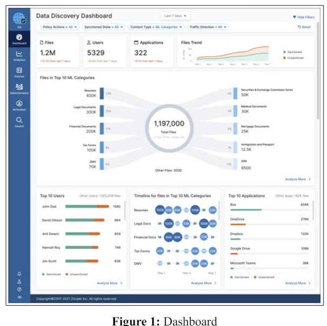
The unmet need to show the breakdown of total files into 10 different categories that are surfaced by leveraging the ML technology in the background led to the innovative ‘Ten-Arm Spider’ data visualization that quickly calls for attention and summarizes findings. A standard bar chart or donut chart could have achieved the same results. However, we also wanted to keep it as large as possible and aesthetically pleasing to draw attention and communicate the insights quickly. Each of the Arms represents the distribution of sensitive data types such as Resumes, Legal Documents, Financial Documents, Tax Forms, DMV, Securities & Exchange Commission (SEC) Forms, Medical Documents, Mortgage Documents, Immigration and Passport and SSN. Every category of files is presented in whole numbers as well as in percentages. The varying intensity of the blue color at the end of the arm is to guide the attention and reading pattern from highest to lowest amount, ordered from top left to bottom right. ‘Other files’ at the bottom are the ones that did not fit in the top 10 MLbased categories.
Hovering on an arm highlights it and also displays details about the category inside the tooltip. Clicking on the arm takes users to the drill-down page with that specific category selected.
In the bottom section of the dashboard, security analysts can see the Top 10 users and the corresponding number of files that they are interacting with. Also, the breakdown inside tooltips shows how many of those files are coming from sanctioned vs. unsanctioned applications. The timeline chart with the bubbles shows how many files were downloaded and uploaded on a given day for the top 10 categories. The third widget shows the Top 10 applications that contain the most number of files and whether the application is sanctioned or sanctioned. Each widget has an analyze more button that takes them to the drill- down page with appropriate columns arranged first.
We envision a novel interaction design paradigm of 4 levels of drill-down on a single page. We provide a full breakdown of data along with the appropriate level of user control and number of clicks optimization to reduce the time taken for analysis. As shown in Figure 2 (a) to (e), The drill-down consists of four lanes. The first one has the content type or data classifications. As shown in Figure 2(a), clicking on the ‘Tax Forms’ tile opens up a second column with all the applications that have tax forms. Selecting the ‘Box’ tile from those applications subsequently populates the third column with a list of the users using the Box application. Similarly, selecting a specific user from the third column will open up the fourth and last pane to show what File Types the preselected user is interacting with. Thus, an admin can carve an investigative path with a step-by-step progressive disclosure. This novel interaction aims to assist admins in ‘finding the needle in the haystack.’ The interdependence of the columns based on the selection from the previous tile makes the overwhelming amount of data easy to dissect.

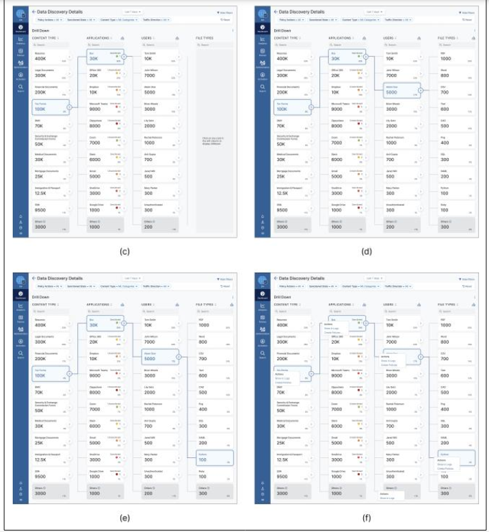
Figure 2: Drill-Down Workflow Interface
We conducted 30-minute follow-up interviews for the usability study. The participants were asked to observe and interact with the Figma prototype of the dashboard and drill- down page to complete the three-step task 1. Monitor the dashboard, 2. Drill down to a specific user, 3. Change the policy for that user. We asked them to interpret the information presented on interfaces in a ‘Think-out-Loud’ manner. It was followed by a short questionnaire to capture their reactions and feedback.
Overall the feedback was positive. 9 out of 10 participants found both the dashboard and drill-down user-friendly, aesthetically appealing, and intuitive. One of the participants said ‘I like the spider diagram. It’s great to grab the attention and then the other surrounding widgets also help to understand the status of data.’ Another participant mentioned, ‘I have not seen anything like it [drill-down flow] before. This is fascinating. I like how simple it is without taking you into a bunch of different screens’.
Although the overall reaction and feedback were positive, we noted some limitations of the design. 2 out of 10 participants misinterpreted the spider diagram as a Sankey chart. They thought that it indicates the data flow from left to right of the circle. In future iterations, the use of some micro- animations might make the direction of arms and respective data flow clear by showing the extension of each arm dynamically coming out from the circle in the center to the outward. One other participant asked about the possibility of exporting the drill-down path in the spreadsheet or .csv format which can be explored in the future.
This design focused on the data generated through cloud-based applications. The same dashboard and drill-down pattern can be extended to other use cases such as endpoint data security management to visualize and prevent data loss from endpoint channels such as printers, USBs, Bluetooth and personal cloud storage.
A similar workflow can be applied to improve the visibility of email security incidents where suspicious activities in incoming and outgoing emails can be tracked and investigated systematically to inform the policy configurations.
In this paper, we studied the data protection space by interviewing security administrators. Based on insights, we designed the novel prototype dashboard and drill-down and shared the usability evaluation results. This research contributes novel data visualizations and interactions for cyber- security professionals along with measuring its usability with target users. We hope this research guides future design practitioners with improved data security workflow and productivity of the target users.