Author(s): Shriyash Shete
This paper presents an innovative dashboard design for cybersecurity risk management, addressing the urgent need for effective visualization and quantification of cyber threats in organizations. Through semi-structured interviews with security executives, we identify key challenges in cybersecurity operations and propose a user-centric dashboard. This tool integrates an overall risk score, trend analysis, global threat mapping, and a three-step workflow from risk insights to remediation, all aimed at enhancing decision-making for Chief Information Security Officers (CISOs) and their teams. Usability testing underscores its effectiveness and user-friendliness, signaling a significant step forward in cybersecurity risk management by providing a comprehensive, intuitive, and actionable overview of an organization’s security posture.
In today’s macroscopic climate and associated economic challenges, cybersecurity is one of the critical mandates and top priorities for the majority of the companies in the industry. Cybersecurity executives and IT leaders are judiciously reevaluating their cybersecurity investments and redefining the approach that is needed to keep their digital assets secured [1,2,3]. Their key objective is to protect the company and its employees from external cyberattacks, malicious activities by threat actors and potential data breaches. Having a robust risk management plan laid out along with a well-established, easy- to-operate and resilient digital infrastructure has become a necessity in the company’s growth, thereby avoiding unwanted financial burdens that may incur in the recovery from an unforeseen cyberattack [1,2,4].
Cybersecurity professionals in leadership roles such as Chief Information Security Officer (CISO) as well as front-line workforce of Security Operations Center (SOC) analysts aim to monitor, evaluate, and control the overall security posture of the organization. They usually focus on both preventive as well as reactive approaches meaning that their primary goal is to prevent cyber risk proactively before it happens and also mitigate the risky behaviors that are observed in the company’s existing security digital environment [5,6]. The time taken to set up the governing rules, policies and criteria with existing legacy security tools may take anywhere between a few hours to a few weeks. Also, the average time to remediate a cybersecurity risk known as Mean Time to Remediate (MTTR) is 58 days according to recent studies and reports [7].
Thus, every minute if not the second counts and could mean millions of dollars of loss if the cyber protection is overlooked and the breach recovery process is delayed. The majority of the time, the volume of data is too large and the analysis takes place with the help of multiple spreadsheets. Moreover, legacy solutions fail to provide the breadth of visibility into cyber risk and attack exposure necessary to accomplish holistic control over cyber protection [3,6]. This paper examines the challenges cybersecurity professionals face while protecting the business and further proposes an innovative, usable dashboard and workflow visualization that unifies different approaches to monitor and synthesize cyber risk insights in a single interface so that CISOs and their teams of analysts can achieve alignment and be prepared to perform necessary actions efficiently
Zero-Trust Architecture in cybersecurity recommends strengthening the security across four key stages of breaches namely: 1. External attack surface, where the threat actor attempts to discover the organization’s external attack surface exposed to the internet. 2. Compromise: Threat actor attempts to compromise an organization’s corporate assets via threats delivered from the internet. 3. Lateral Propagation: The threat actor attempts to move laterally within the organization’s environment from the compromised asset. 4. Data Loss: Threat actor steals sensitive data as part of the actions on the objective stage [3,8].
The dashboard term originally comes from car dashboards that are meant to inform drivers about the car’s various systems with Red, Yellow, and Green indicators. In an organization, the term dashboard is used to describe a system that visualizes data useful for decision-making [9,10].
Design principles are abundant in the literature, but they must be targeted to tasks associated with cyber defense. The Pragnanz principle states that humans tend to process simple patterns faster than complex patterns [11,12]. Thus, Visualization designers should arrange visual objects logically
We conducted online, semi-structured interviews with 13 security executives from medium-sized (1000-5000 employees) as well as large enterprises (5000+ employees) to identify their needs and challenges they face when it comes to streamlining security operations and measuring the impact. The titles of the participants included CISO, CSO and VP of Security. Each participant was interviewed in two parts. A one-hour initial interview focused on generative insights about the pain points and needs. A 30-minute usability test was aimed at evaluating the prototype we designed using Figma.
Through the qualitative affinity mapping method, we analyzed interview data and derived end users’ key responsibilities, goals and challenges:
• Visibility of and insights into the security posture
• Impact of threats detected and blocked
• Risky users, locations, devices and other entities
• Security policy deployment correctness
In addition, the current macroeconomic environment and external pressure from regulatory bodies, such as the Securities Exchange Commission (SEC), require IT leaders to quantify and communicate cyber risk to internal stakeholders, business leaders, board members, government regulators, cyber insurance underwriters, and third-party vendors [3]. Legacy solutions fail to meet this requirement for real-time, data- driven cyber risk management. These are often a medley of point solutions, spreadsheets, and manual aggregation of results. Thus, we realized that CISOs and security professionals need to have a new approach to quickly measure the impact, quantify the security risk and identify the root cause behind a suspicious activity
CISOs are, just like other executives, busy attending meetings with different teams and groups of people to manage the security posture of the organization. Hence we propose an easy-to-scan one-stop-shop overview dashboard that will surface the insights and help them prioritize their decisions.
They like to see visuals such as graphs, charts, trends, etc. One of the CISOs mentioned it during the interviews- “I’d like to see more trends and peer org comparisons. My key question at the end of it is, what should be my takeaway from this information? What should be my next step?”
All participants expressed the need for a “40,000-foot view” and situational awareness to understand any exposures they may have before they can be exploited. Organizations with a large and complex policy structure often lack the high-level visibility and insights required to holistically evaluate and compare their organization’s posture against emerging cyber threats as their configuration continues to evolve to meet the growing needs of the business.
Based on the needs identified through user research, we envision and propose a holistic view of risk insights through dashboardto-remediation workflow. The mockups were created using the Figma tool which allowed us to test the usability with CISOs asynchronously, gather feedback, and iterate rapidly to make it as close to their needs as possible.
As shown in Figure 1 below, the workflow mainly consists of a three-step analytics framework to navigate from big-picture data to granular-level information:
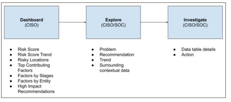
Figure 1: Dashboard-Explore-Investigate Workflow
Dashboards are meant to provide quick highlights at a glance and hence it’s the first interface that should be presented to CISOs. They should interact with it to get an overview of the security posture. We decided to show an aggregated Overall Risk score-a single overarching number between 0-100 where the lower score indicates the lesser cyber risk. So the goal of CISOs would be to reduce and maintain the score as low as possible. As shown in Figure 2, the dial at the top of the Dashboard resembles the traditional speedometer dial on the automobile dashboard and immediately communicates the real-time, overall security health of the company. The score is divided into 4 levels of severity - low, medium, high and critical displayed using industry-standard colors.
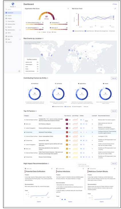
Figure 2: Dashboard Interface
The overall risk score is nothing but the average of the risk scores of 4 major categories-1. External Attack Surface, 2. Compromise, 3. Lateral Propagation, 4. Data Loss, normalized to present it out of 100. These are the key cybersecurity breach stages outlined in Zero-Trust security architecture. For each stage, the score out of 100 is computed based on the sum of the individual contributing factors’ risk scores. In short, a contributing factor is the fundamental unit or a building block on which this risk framework is based. One of the CISOs mentioned that “Having a trend line to see how the risk score has changed over the period would be very helpful.” The risk Trend widget showcases the trend line for the last 30 days along with the industry peer average score so that it’s easy to compare the organization’s risk score with other companies in the same domain.
The global map gives an overview of the locations around the world where the risk events are taking place in real- time. With the help of this map, determining which location is contributing to the risk score becomes easy. Similar to attack stages, the dashboard also visualizes the cybersecurity risk across four entities-Workforce, third-party integrations, Applications, and Assets. This unique lens to dissect the risk score allows enterprises to gain a more accurate picture of their risk exposure, correctly prioritize mitigation efforts, and make informed cybersecurity investment decisions.
We included the Top 10 risk contributing factors upfront in the dashboard so that it curates a prioritized list for executives. They can learn the top drivers of an enterprise’s cybersecurity risk with the ability to drill down into each contributing factor. Finally, towards the bottom, we have risk insight cards where the risk findings are clustered and presented in bite-size informative cards which create predefined paths for further focused investigation.
Every risk insights card is tailored to a unique risk finding and has a brief explanation of the problem, the recommendation and the trend line. There can be multiple contributing factors associated and combined with each insight card. Clicking on “Explore” in a risk insight card takes users to a detailed view where we display an inter- mediate exploration dashboard that has a set of widgets related to the selected risk insight (See Figure 3). It can leverage common and intuitive data visualizations such as donut charts, bar charts, line charts, etc. This interface helps users with additional contextual data visualized so that they can explore and infer the insights in many different ways. CISOs can choose to review this “15,000- foot” data or they can simply assign the explore and investigate tasks to their operations team.
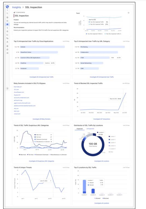
Figure 3: Explore
Users can then select a widget with a specific metric on the Explore page and investigate further at a granular level. Clicking on the “Investigate” button in each widget curated takes users to a page that contains all relevant records displayed in a large data table, as shown in Figure 4. Thus, slowly unfolding the data as and when required aligns the step-by-step investigation with the user’s mental model and does not overwhelm users with information overload situations. It provides an adequate amount of user control. With the help of filters, users can quickly point out a specific malicious user or application, or device. Each row can have clear action buttons, e.g. Block, to take necessary steps to remediate the risk.
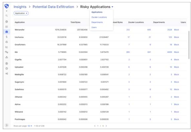
Figure 4: Investigate
We evaluated the task completion rate using a Figma prototype with all 13 participants in 30-minute sessions. It was a moderated session and we asked users to think out loud while they tried to navigate and interact with the interface. We also collected overall qualitative feedback towards the end of each usability test session.
The usability testing task was divided into 3 specific sub- tasks:
• Identify the top risk insight card on the dashboard
• Explore the context for the ‘Potential Data Exfiltration’ card
• Investigate the top risky applications and block them from
data breaches.
The average time to complete the task was 17.2 minutes. This included the time participants took to learn the interface. 9 out of 13 participants (69.2%) were able to complete the task successfully without making any errors. 11 out of 13 participants (84.61%) found the interface intuitive and provided positive reactions. 6 out of 13 participants said they would like to export the dashboard in slide format so that they can present and share the reports with other stakeholders. 6 out of 13 participants expressed the need to showcase the financial impact associated with risk and remediation.
Although the majority of the participants could complete the given task in a few minutes as opposed to days and praised the user experience of the dashboard as easy to use, it comes with some limitations. The task defined did not consider all the nuances that might come with other investigation use cases with different risk insights. The number of widgets in explore pages may vary depending on the recommendation card selected and hence it can be more time-consuming for complex data sets. This research primarily focuses on CISOs and executive persona and they might not use the explore and investigate pages frequently as compared to their operations team members. Testing the flow with security operators and analysts would generate further research insights.
The design prototype in Figma was for a desktop version of the interface. It would be worth designing it for mobile phones and measuring the usability with changes in screen size. CISOs might benefit from an easy-to-scan dashboard on the mobile phone interface.
We plan to include other valuable data points such as displaying the financial risk associated with each contributing factor and providing a way to download and share the dashboard results with other team members.
This design addresses the existing problem of information visualization for cybersecurity executives to quantify and measure the security risk of the organization. By helping CISOs and Security analysts monitor, evaluate and mitigate cyber risk through this novel design approach, we hope CISOs to achieve more visibility and productivity in overall risk management. The paper takes forward the benefits of the dashboard design paradigm and tailored step-by-step workflows for a diverse set of future analytical and data visualization challenges in the enterprise digital products realm