Author(s): Zainab Rabbaa* and Fatima Gueddou
This research delves into the intricate relationship between color and its impact on human emotions. It unveils that the way we perceive and respond to colors is not a universal phenomenon, but rather a multifaceted interplay influenced by diverse factors such as language, culture, environmental conditions, and even individual gender. Furthermore, our research uncovers the intriguing connections between color and various external stimuli, including sound and other surrounding colors. It elucidates how color exerts a direct influence on our emotional states, subsequently affecting behaviors, sleep patterns, levels of aggression, and overall energy levels. Notably, we find that bright, vibrant colors with longer wavelengths tend to evoke greater stimulation and arousal compared to their less saturated, darker, and shorter wavelength counterparts. The study also delves into the symbolism of color within the realm of cinema, demonstrating that colors can convey a wide array of seemingly contradictory concepts even within the same cinematic narrative. This underscores the critical role of contextual cues in shaping the interpretation of color. In essence, this research underscores the notion that cinematographers, whether consciously or unconsciously, leverage insights from neuroscience and symbolism to craft compelling visual narratives that profoundly influence the emotional engagement of their audiences
This research delves into one of the most potent yet enigmatic elements within the realm of cinematography: color. Color has a remarkable capacity to influence us, whether at a conscious or subconscious level. By embarking on a scientific exploration of the neurological and physiological impact of color, the primary objective of this study is to enhance our comprehension of how color shapes human emotions.
Following the acquisition of this fresh knowledge, our aim is to meticulously analyze cinematic works and reveal the adept ways in which some of the world's most accomplished cinematographers employ color as a potent tool to evoke emotional responses.
Furthermore, this study aspires to empower cinematographers by rendering their intuitive creative decisions into deliberate choices, thus enabling them to craft more profound and emotionally resonant films.
This research embarks on a comprehensive examination of the science of color and its applications in the cinematic medium. It adopts a multi-faceted approach, encompassing the symbolic, psychological, and aesthetic dimensions in the analysis of color within the realm of cinema. Ultimately, this study contemplates the symbiotic relationship between science and artistry in the digital age, contextualized within the historical backdrop of color's utilization in analog film techn
Distinguishing itself from prior studies, this research explicitly recognizes the dichotomy between light, which constitutes electromagnetic radiation beyond direct human vision, and color, a perceptual experience intricately constructed by the human brain.
This study delves into the multifaceted realm of color perception, aiming to establish a scientific foundation within the fields of neuroscience and physiology. By scrutinizing the neurological and physiological underpinnings of color's impact on individuals, we seek to comprehend the extent of universal color perception. Notably, contend that men and women do not perceive colors in the same way [1]. Males require longer wavelengths compared to females to discern the same hue. This observation underscores the intricate relationship between gender and color perception.
Furthermore, this research emphasizes two fundamental categories for the perception of color: the biological response and color memories, which encompass learned and cultural influences (Lee and Joohyeon, 2005). Through the examination of scientific evidence, we endeavor to unravel the mechanisms underpinning these responses. Interviews with renowned neuroscientists from The Sussex Colour Group, a leading research team in the field of color science, provide valuable insights into how color can profoundly affect human psychology.
Building upon these foundational understandings, this study extends its scope to the realm of cinema. We explore the universality of color perception and its susceptibility to various influences, including language, color memories, color consistency, color combinations, and the cinematic experience itself. Neuroscientist Sam Berens, affiliated with the University of Sussex, posits that individuals perceive color through the filters of language and memory, resulting in unique perceptual experiences. Language, in particular, plays a pivotal role in how we categorize and group colors, ultimately shaping our perception and cognition.
Furthermore, Berens underscores the significant role of memory associations with specific colors, as they can be triggered by color perception. This aspect is probed to comprehend its implications and the myriad factors contributing to the individuality of color perception. In light of the scientific revelations, this study posits essential questions concerning cinematographers and image makers. They often seek to evoke emotions transcending cultural boundaries, which necessitates a profound understanding of the intricate and varied nature of color perception. Ultimately, this study seeks to bridge the gap between science and artistry, forging a deeper comprehension of how color can be harnessed as a powerful tool for emotional impact within the realm of cinema.
The perception of color in art derives its essence from the objective world, where colors of existing entities serve as the basis for memory, eventually being applied and reconfigured in works of art to craft a distinctive and unique aesthetic style. The aesthetic value of color in visual storytelling thrives on the fusion of the creator's subjective feelings, emotions, and ideas, rendering color contrasts more pronounced and infusing works with deeply personal sentiments and concepts that resonate profoundly with the audience. In animation, an art form that encapsulates design, modeling, language, music, color, and script, color represents an essential means of expression, amplifying the emotional depth and central themes that creators seek to convey.
Throughout its history, the evolution of cinema has witnessed a transformative journey from the era of black and white silent films to the advent of stereophonic sound and color. Color assumes a pivotal role in the realm of audio-visual storytelling, acting as a catalyst for character development, emotional expression, scene creation, and the establishment of atmospheric nuances. In every frame and every perspective, color immerses the viewer, eliciting emotional resonance and fostering an intimate connection with the narrative.
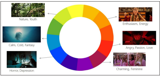
Each color possesses a unique set of emotional and symbolic attributes. Over time, individuals have intuitively associated specific emotions and sentiments with particular colors, although color itself lacks inherent emotions. Instead, it possesses the capacity to evoke moods and elevate emotions in various contexts. For instance, green often conjures images of nature, evoking a sense of vitality, youth, abundance, and equanimity, making it the most serene color in the natural world. Conversely, red is often linked to notions of blood and fire, stirring inspiration and fortitude. Yellow is reminiscent of sunlit fields, symbolizing prosperity and hope, imparting a feeling of abundance, comfort, affluence, and clarity. On the other hand, black, being the darkest of colors, evokes notions of night and shadow, typically invoking solemnity, gravity, and a sense of foreboding or melancholy. The fusion of diverse colors serves as a powerful tool in highlighting the creator's artistic intent and evoking emotional resonance among the audience. It enriches the emotional depth of characters in film narratives, ensuring that the creator's intended emotions are vividly and distinctly perceived by the viewers.
In summation, the presence of color in cinema art represents a significant contributor to the emotional and narrative impact of the medium. It transcends its visual characteristics to elicit profound emotional responses and to convey the artistic intentions of the creator, ultimately enhancing the cinematic experience and leaving an indelible mark on the audience.
The intricate relationship between color and human emotions has been the subject of extensive research, and this article offers a comprehensive overview of this dynamic interplay. Notably, color has a direct and profound impact on our emotional states (Conway, 2012). Several scientific investigations have scrutinized the influence of various lighting conditions on emotional responses elucidates that light, in addition to stimulating visual areas, indirectly affects hormone balance and psychological states by triggering responses in hormone and nerve centers within the brain [2,3]. The pineal gland, for instance, regulates diurnality based on how it reacts to light and darkness.
Furthermore, Küller suggests that factors such as glaring light, strong colors, and sharp contrasts can lead to increased reticular activation, resulting in heightened psychological arousal and alertness [3]. Long-wave light (red) appears to be more activating than middle and short-wave light (green, blue). Additionally, subtle flicker effects, though imperceptible to the naked eye, can induce excessive activation (p.3).
Valdez and Mehrabian note that shorter wavelength colors (blue and green) tend to be less arousing than longer wavelengths (red and yellow) [4]. They posit that arousal is positively correlated with color saturation and brightness (ibid, p.396). Cheng et al. (2009) corroborate this observation, suggesting that warm colors, especially red, are physically and emotionally arousing, exciting, and distracting, whereas cool colors, particularly blue, evoke feelings of relaxation, tranquility, and calm (p.327).
Interestingly, the practical application of color psychology has been witnessed in diverse contexts. Japanese rail companies, for example, have adopted blue lighting on railway platforms, which has contributed to a significant reduction in railway-related incidents [5]. This transition to blue lighting is believed to create a more pleasant and less stimulating atmosphere, potentially dissuading individuals from acting on harmful impulses. Additionally, blue lighting on streets has been shown to reduce crime rates (Grohol, 2008; Chicago Tribune, 2008). Blue's calming and soothing properties, coupled with its universal association with police presence and security, potentially contribute to this effect.
In contrast, research conducted by Attrill et al. suggests that red shirts have been linked to the success of English footballers [6]. Guéguen and Jacob reveal that male customers in restaurants tend to offer higher tips to waitresses wearing red attire, as it enhances their perceived attractiveness [7]. However, Bagchi and Cheema highlight that scientific evidence demonstrates that red can induce arousal, potentially leading to heightened aggression [8]. Their findings reveal that red, as a background color, increases aggressive tendencies in auctions, while blue diminishes these behaviors more rapidly than gray. This understanding of how colors can evoke specific emotional responses offers valuable insights for cinematographers seeking to harness color's power in their visual storytelling.
The article also delves into the question of the universality of human emotional reactions to color. Bellantoni conducted an experiment in which art and film students from various cultures were asked to depict emotions through color [9]. The results indicated remarkable similarities, as light, pale colors such as blue and peach were associated with tranquility, while dark reds and contrasting colors were linked to rage. Scientific research supports these universal color-emotion associations, with adults commonly assigning yellow to happiness, blue to sadness, and red to anger (BBC, 2011). This universal understanding of color- emotion connections is leveraged by businesses in marketing.
Moreover, studies have revealed that people in industrialized cultures generally prefer blue to yellow (Valdez and Mehrabian, 1994; Ou et al., 2003; Taylor, Clifford, and Franklin, 2012). Preferences for colors are often influenced by their associations with liked or disliked objects. For example, blue is favored for its association with clean water, while green-yellow is less liked due to potential associations with less pleasant elements. Interestingly, Taylor, Clifford, and Franklin (2012) challenge the notion of universal color preferences by demonstrating that cultural, social, and environmental factors exert significant influences on individual preferences. They highlight the difference between industrialized cultures dominated by high- color saturated artificial objects and the Himba people, who live among natural materials. Research on color combinations indicates that people often prefer disharmonious combinations to harmonious ones, but they are more likely to dislike harmonious combinations than to prefer disharmonious ones.
By comprehending the complexities of color preferences, cinematographers gain valuable insights into how diverse cultures may aesthetically perceive colors, thus influencing the enjoyment of their visual narratives.
Color, as demonstrated throughout this research, serves as a pivotal element in the realm of filmmaking, akin to a multi-dimensional character with complex and often seemingly contradictory attributes. Even within a specific cultural context, color exhibits inharmonious properties that contribute to the depth and richness of cinematic narratives. It is a dynamic element whose meaning is inherently intertwined with its context, sometimes evolving within the confines of a single film itself, as exemplified by the dual symbolism of red in movies like Sin City and Dick Tracy, representing both love and death.
As established earlier, color perception is not entirely universal, subject to variations influenced by language, contemporary culture, gender distinctions, and individual memories. Nevertheless, underlying this diversity, there exists a common thread—how normal adults process color remains consistent. However, the inherent cultural variability in the symbolism of color demands that image makers remain cognizant of the potential divergence in meaning when conveying messages through color.
The case studies presented herein underscore the significant role of color in cinematography, whether employed consciously or unconsciously by filmmakers. By delving into the intellectual, symbolic, and unconscious physiological responses to color, cinematographers can articulate the rationale behind their color choices. What might have previously been guided by intuition can now find a scientific explanation. This growing body of knowledge has the potential to revolutionize artistic decision-making by offering a deeper understanding of the impact of color.
Scientific research enlightens us about the latent influences on our creative choices, equipping cinematographers to elucidate and defend their decisions with newfound clarity. Ultimately, a more profound understanding of color science empowers cinematographers to craft narratives that are not only more aesthetically pleasing but also emotionally resonant, fostering a stronger connection between the audience and the cinematic experience.
1.Abramov I, Gordon G, Chavarga A (2012) Sex and vision II: color appearance of monochromatic lights. Biology of Sex Differences 3: 21.
2.Radulescu E, Christodoulou J, Mania K, Critchley H, Watten PL, et al. (2012) Simulated artificial illumination influences neural and behavioural correlates of presence in virtual environments: an fMRI study. Poster in the 16th annual meeting of the Association for the Scientific Study of Consciousness, Brighton, UK.
3.Küller R (1986) Physiological and Psychological effects of illumination and colour in the interior environment. Journal of Light & Visual Environment 10: 1-5.
4.Valdez P, Mehrabian A (1994) Effects of Color on Emotions. Amercian Psychological Association 123: 394-409.
5.Matsubayashi T, Sawada Y, Ueda M (2013) Preliminary communication: Does the installation of blue lights on train platforms prevent suicide? A before-and after observational study from Japan. Journal of Affective Disorders 147: 385-388.
6.Attrill M, Karen A Gresty, Russell A Hill, Robert A Barton (2008) Red Shirt Colour is Associated with Long-term Team Success in Engish Football. Journal of Sports Sciences 26: 577-582.
7.Gueguen N, Jacob C (2012) Clothing Color and Tipping: Gentlemen Patrons Give More Tips to Waitresses with Red Clothes. Journal of Hospitality & Tourism Research 20: 1-6.
8.Bagchi R, Cheema A (2013) The Effect of Red Background Color on Willingness-to-Pay: The Moderating Role of Selling Mechanism. Journal of Consumer Research 39: 947-960.
9.Bellantoni P (2005) If It's Purple, Someone's Gonna Die: The Power of Color in Visual Storytelling. USA, Elsevier h t t p s: / / www . t a y l o r f r a n c i s. c o m / b o o k s/ mono/10.4324/9780080478418/purple-someone-gonna-die- power-color-visual-storytelling-patti-bellantoni.
View PDF